


Overview #
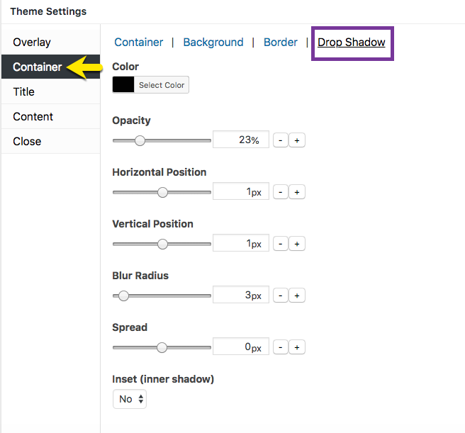
Figure 1 (above). View of the Container >> Drop Shadow option settings for the Default Theme.
The Container option tab controls the styling for the popup container. This article addresses the Drop Shadow category which includes 7 properties to style a shadow effect around the popup container.
Note: To set a drop shadow, the popup border style must be set to a value other than ‘None’. In the Theme Settings box, go to Container >> Border to select a value for Style.
Property Descriptions #
- Color styles the drop shadow color. Default (all themes): black / hex number: #020202.
- Opacity styles the color density of the drop shadow. An opacity of 100% is a fully saturated color, while a value of 0% is fully transparent.
- Horizontal Position extends and shifts the drop shadow horizontally. A positive value extends the shadow to the right, while a negative value extends the shadow to the left.
- Vertical Position extends and shifts the drop shadow vertically. A positive value extends the shadow below the container, while a negative value extends the shadow above it.
- Blur Radius extends a color gradient outward from the edge of the popup container. The higher the value, the greater the width of the gradient.
- Spread uniformly spreads the shadow effect away from the popup container.
- Inset (inner shadow) controls the shadow effect inside the popup container.
Property Default Values for Each Popup Theme #
#
| Popup Theme | Opacity (%) | Horizontal Position (px) | Vertical Position (px) | Blur Radius (px) | Spread (px) | Inset (inner shadow) |
| Default | 23 | 1 | 1 | 3 | 0 | No |
| Light Box | 100 | 0 | 0 | 30 | 0 | No |
| Enterprise Blue | 50 | 0 | 10 | 25 | 4 | No |
| Hello Box | 0 | 0 | 0 | 0 | 0 | No |
| Cutting Edge | 50 | 0 | 10 | 25 | 0 | No |
| Framed Border | 97 | 1 | 1 | 3 | 0 | Yes |
Container Option Settings #
How to Edit Settings #
- Move the slider horizontally; or
- Change the pixel value directly, or
- Select the ‘- / +’ buttons to increment changes to pixels.
Preview Changes in the Theme Customizer #
When editing the Container option styles, use the customizer located to the right of the Theme Settings box to preview your changes.
Select Update to Save Changes #
Select the Update button to save any changes to popup theme settings. Otherwise, any changes will be lost after you leave the page.


