


Overview #
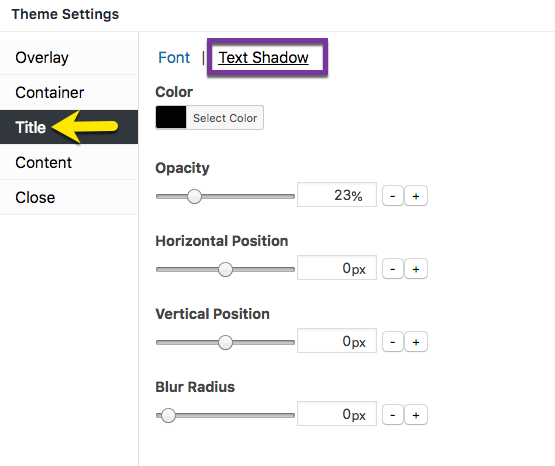
Figure 1 (above). View of the Title >> Text Shadow option settings for the Default Theme.
The Title option tab controls the popup title styles. Use of a popup title inside a popup container is optional. This article addresses the Text Shadow category when styling the popup title.
Property Descriptions #
- Color styles the color of the text shadow.
- Opacity styles the amount of color density of the text shadow. An opacity of 100% is a fully saturated color, while 0% if fully transparent.
- Horizontal Position extends and shifts the drop shadow horizontally. A positive value extends the shadow to the right, while a negative value extends the shadow to the left.
- Vertical Position extends and shifts the drop shadow vertically. A positive value extends the shadow below the title, while a negative value extends the shadow above it.
- Blur Radius extends a color gradient outward from the title text. The higher the value, the greater the width of the gradient.
Title Option Settings #
When editing the Title styles, use the customizer located to the right of the Theme Settings box to preview your changes.
Select the Update button to save any changes to popup theme settings. Otherwise, any changes will be lost after you leave the page.
Color #
Default (all themes): black / hex number: #020202. Range: various. Set the color of the text shadow applied to the popup title text. Click on the Select Color button to display a colorpicker. Each custom color targeted within the colorpicker is represented by a unique hex number.
The text shadow color field also accepts any specific hex number as input. This feature assists users who want to apply a custom color palette on a site. Click on the Default button to reset the title color to the plugin default.
Opacity #
Default (all themes): 23%. Range: 0 – 100%. Set the color opacity (density) of the popup title color.
Edit the opacity value either by:
- moving the slider horizontally; or
- changing the percent value directly, or
- selecting the ‘- / +’ buttons to increment changes to percentage.
Horizontal Position #
Default: 0 px (all themes). Range: -50 to 50 px.
Vertical Position #
Default: 0 px (all themes). Range: -50 to 50 px.
Blur Radius #
Default: 0 px (all themes). Range: 0 to 100 px.


