


Table of Contents
Overview #
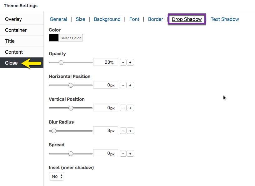
Figure 1 (above). View of the Close >> Drop Shadow option settings for the Default Theme.
The Close option tab controls the styling of the popup close button. The Drop Shadow category styles the drop shadow effect applied outside the button.
Property Descriptions #
- Color styles the drop shadow color. Default (all themes): black / hex number: #020202.
- Opacity styles the color density of the drop shadow. An opacity of 100% is a fully saturated color, while a value of 0% is fully transparent. Default:
- Horizontal Position extends and shifts the close button drop shadow horizontally. A positive value shifts the shadow to the right, while a negative value shifts the shadow to the left.
- Vertical Position extends and shifts the close button drop shadow vertically. A positive value shifts the shadow downward, while a negative value shifts the shadow upward.
- Blur Radius extends a color gradient outward from the edge of the close button drop shadow. As the value increases, the outer edges of the drop shadow blur, and the width of the color gradient increases.
- Spread controls the horizontal and vertical spread of the close button drop shadow.
- Inset (inner shadow) controls the shadow effect inside the popup container. Default (all themes): ‘No’ (off).
Property Default Values Listed by Theme #
| Popup Theme | Opacity ( % ) | Horizontal Position (px) | Vertical Position (px) | Blur Radius (px) | Spread (px) |
| Default Theme | 23 | 1 | 1 | 3 | 3 |
| Light Box | 75 | 0 | 0 | 15 | 15 |
| Enterprise Blue | 23 | 0 | 0 | 0 | 0 |
| Hello Box | 23 | 0 | 0 | 0 | 0 |
| Cutting Edge | 10 | -1 | 1 | 0 | 1 |
| Framed Border | 23 | 0 | 0 | 1 | 0 |
Close Option Settings #
When editing the Close button features, use the customizer located to the right of the Theme Settings box to preview your changes.
Select the Update button to save any changes to popup theme settings. Otherwise, any changes will be lost after you leave the page.


